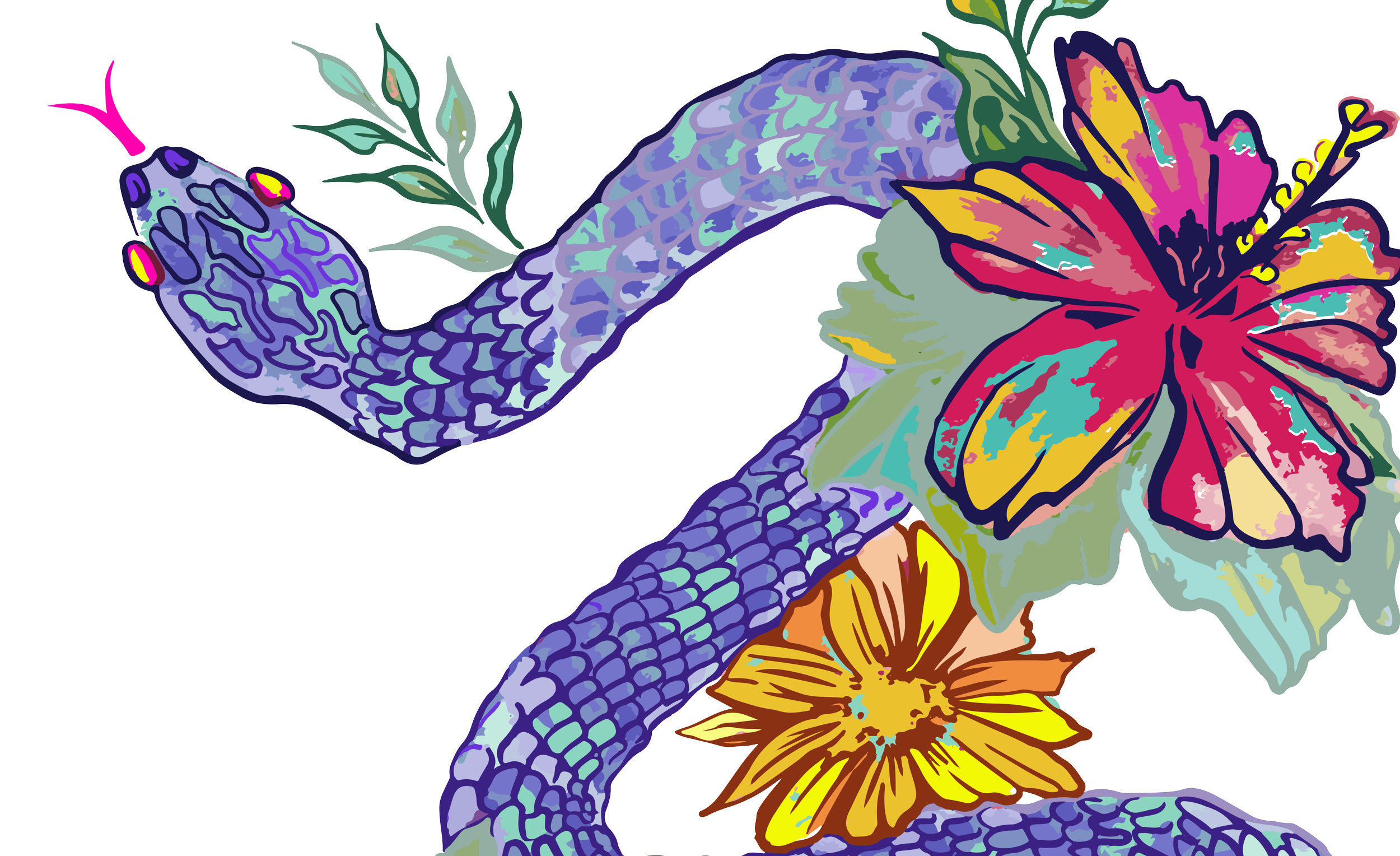
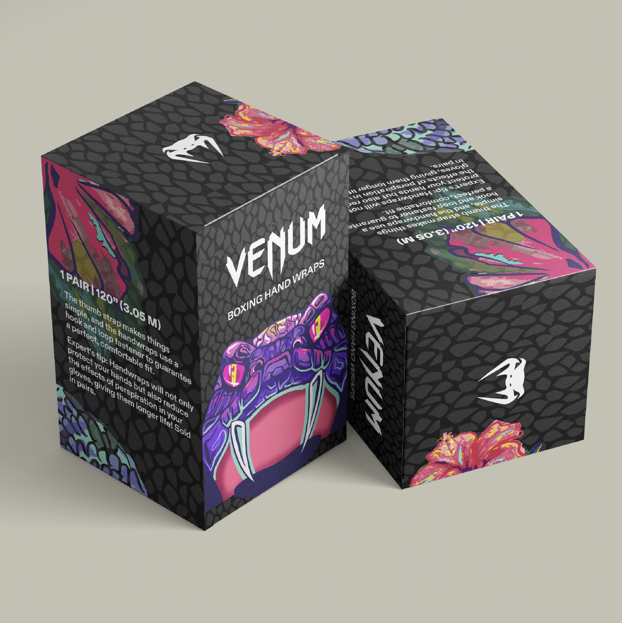
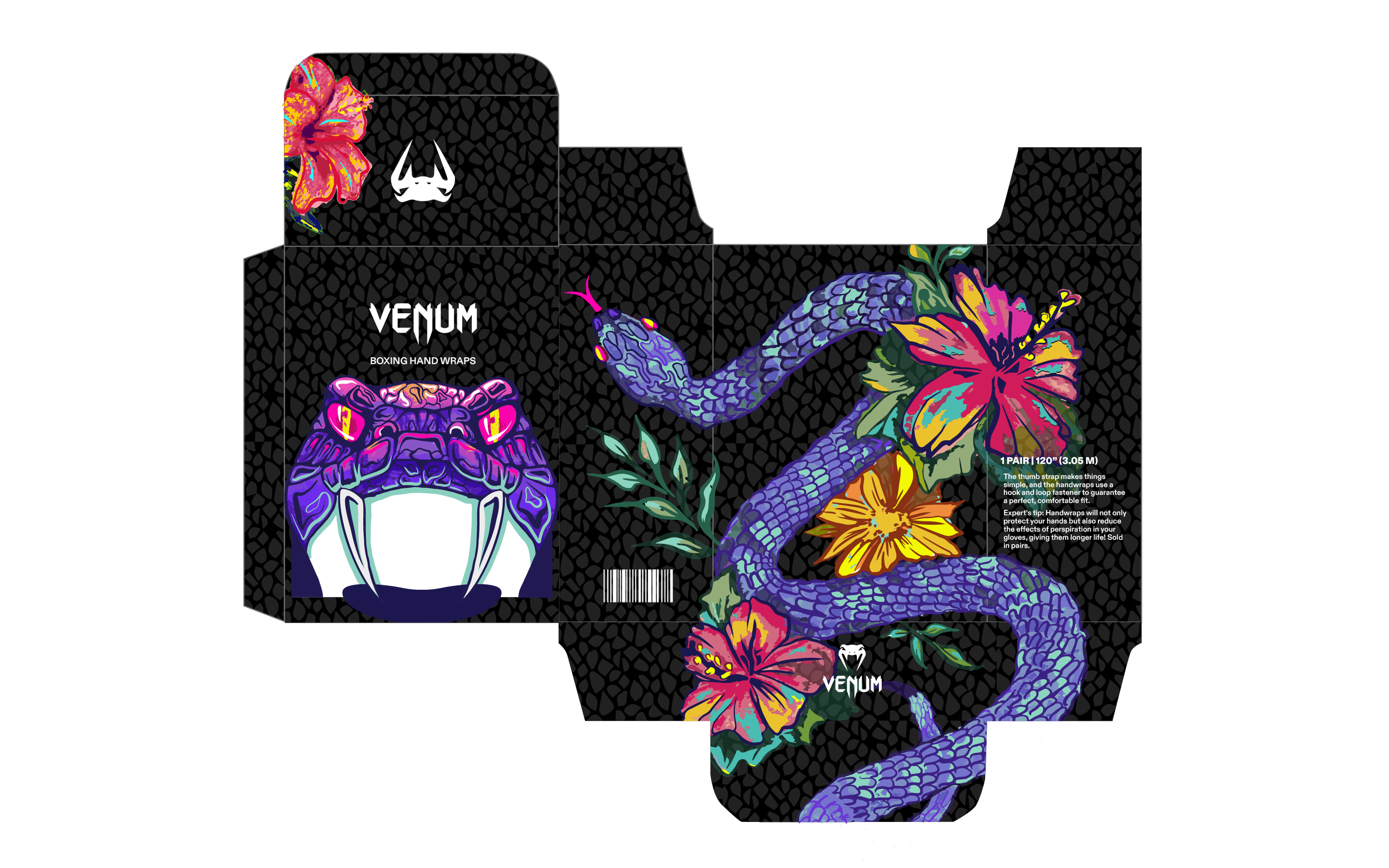
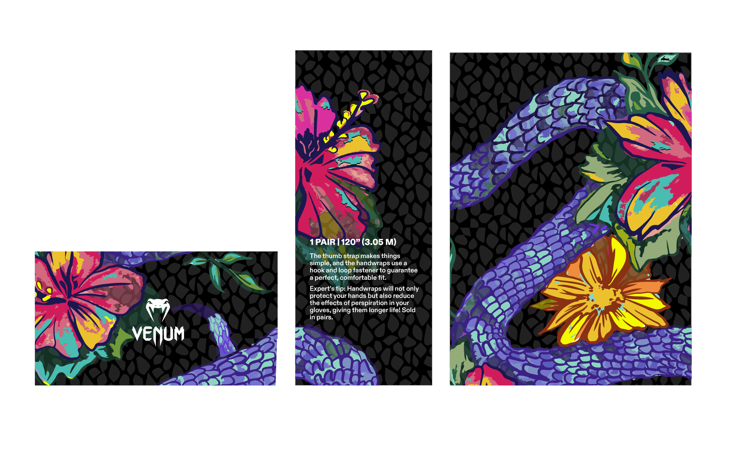
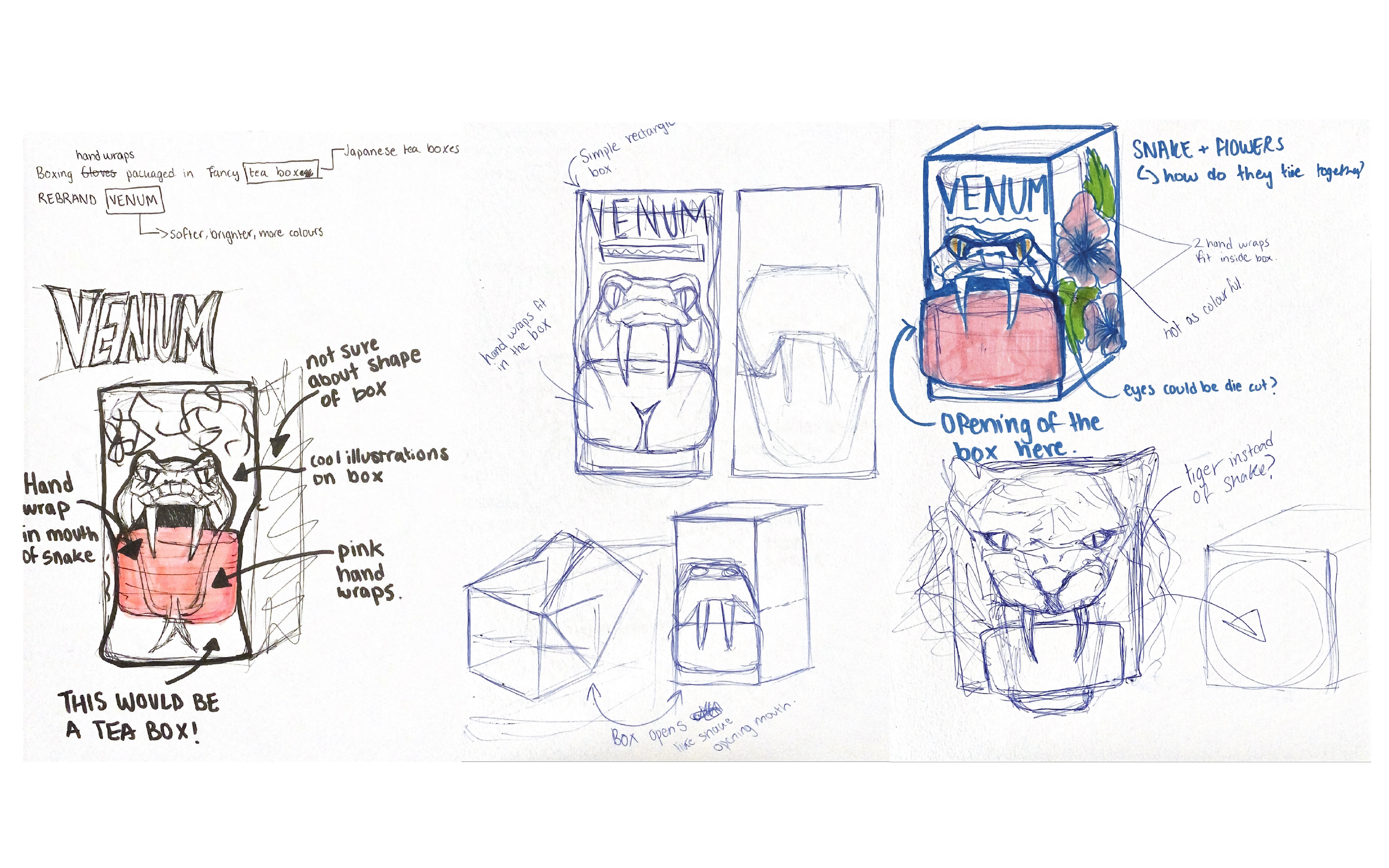
The packaging is intended for boxing hand wraps, which are strips of cloth that are worn under boxing gloves to provide support for hands while training. Over the years in the boxing world, I’ve noticed a trend in masculine design like “Venum,” known for their monochromatic and utilitarian, “masculine” approach when it comes to their product and graphic design. However, with my box, the target audience would be martial artists of all genders, but I saw an opportunity to create a promotional product for International Women’s Day with a more feminine touch.
Previous
Previous
UI Design + Brand Identity
Next
Next
